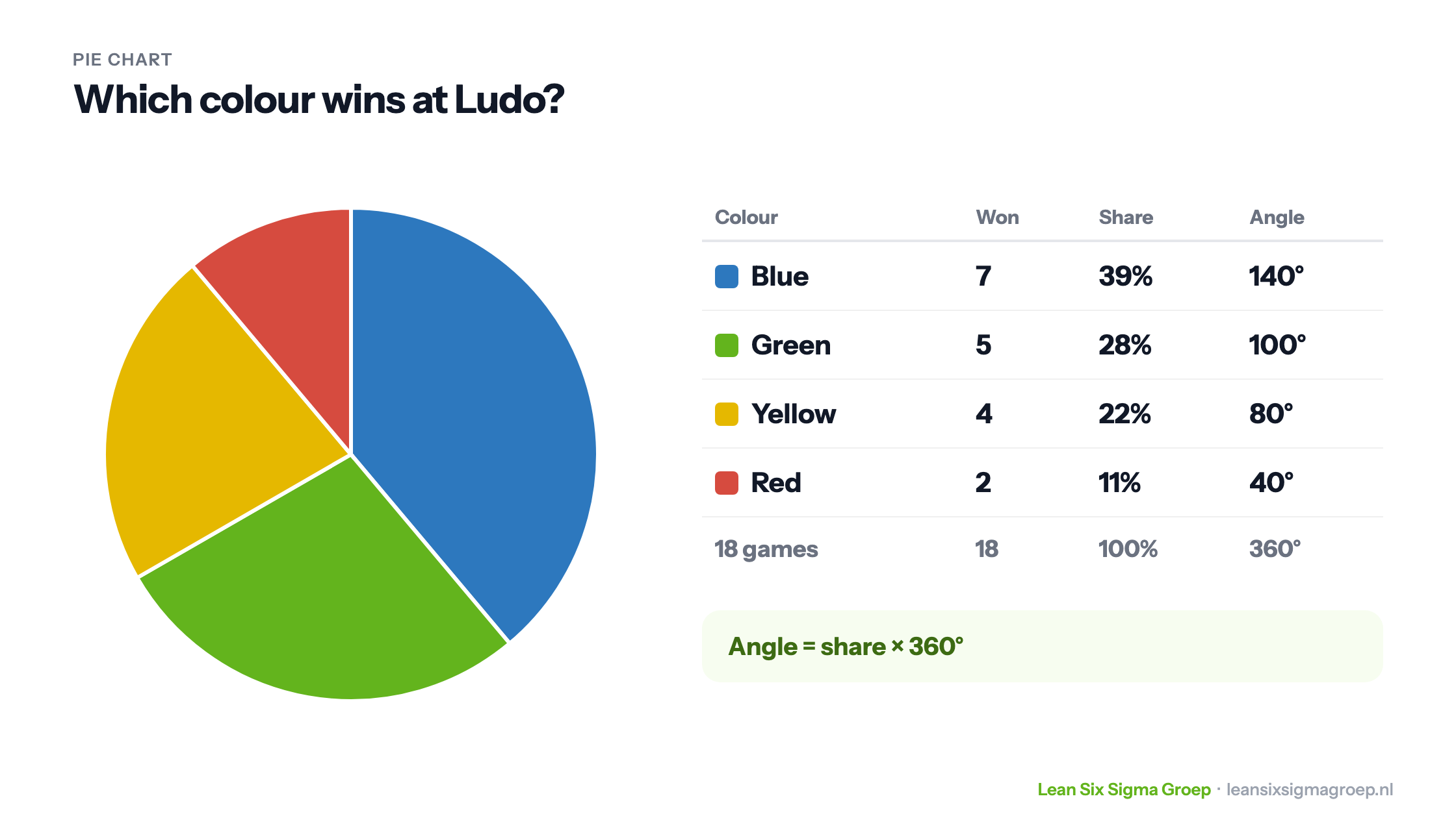
A pie chart shows how a whole is divided into parts. Each category gets a slice, and the larger the share, the larger the slice. It is one of the best-known charts, but also one of the most misused. This article explains when a pie chart works, when you are better off choosing something else, and how to make one yourself.
Where does it come from?
The oldest known pie chart appears in the Statistical Breviary of 1801 by the Scottish engineer and economist William Playfair, who had earlier invented the bar chart and the line graph. A fun fact: in France a pie chart is called a camembert, after the round cheese cut into wedges.
When do you use a pie chart?
A pie chart works for categories that together form a whole, such as the distribution of seats over parties, revenue over product groups or spending over budget items. The categories must be mutually exclusive and add up to 100%. It works best with few categories, five or six at most, and with clear differences between them.
Making a pie chart: an example
Suppose I often play Ludo and keep track of which colour wins. After 18 games, blue has won 7 times, green 5 times, yellow 4 times and red twice. This is how to turn that into a pie chart, as shown in the image at the top of this article:
- Calculate the share per category. Blue won 7 out of 18 times: 7 / 18 = 0.39, or 39%. Green 28%, yellow 22% and red 11%. Together that is 100%.
- Convert the share to degrees. A circle has 360 degrees. Blue gets 7/18 × 360 = 140 degrees, green 100, yellow 80 and red 40 degrees. Together 360 again.
- Draw the slices. Draw a circle and a line from the centre straight up. From that line, mark off the angles one after another with a protractor, clockwise, starting with the largest category.
In practice Excel or another program does this for you, but it shows well what a pie chart really is: a division of 360 degrees.
Advantages
- Part of the whole: at a glance you see that something is about half or a quarter.
- Understandable for everyone: even people without data experience read a pie chart effortlessly.
- Suitable for percentages: such as market shares or the result of a survey with a few answer options.
Disadvantages
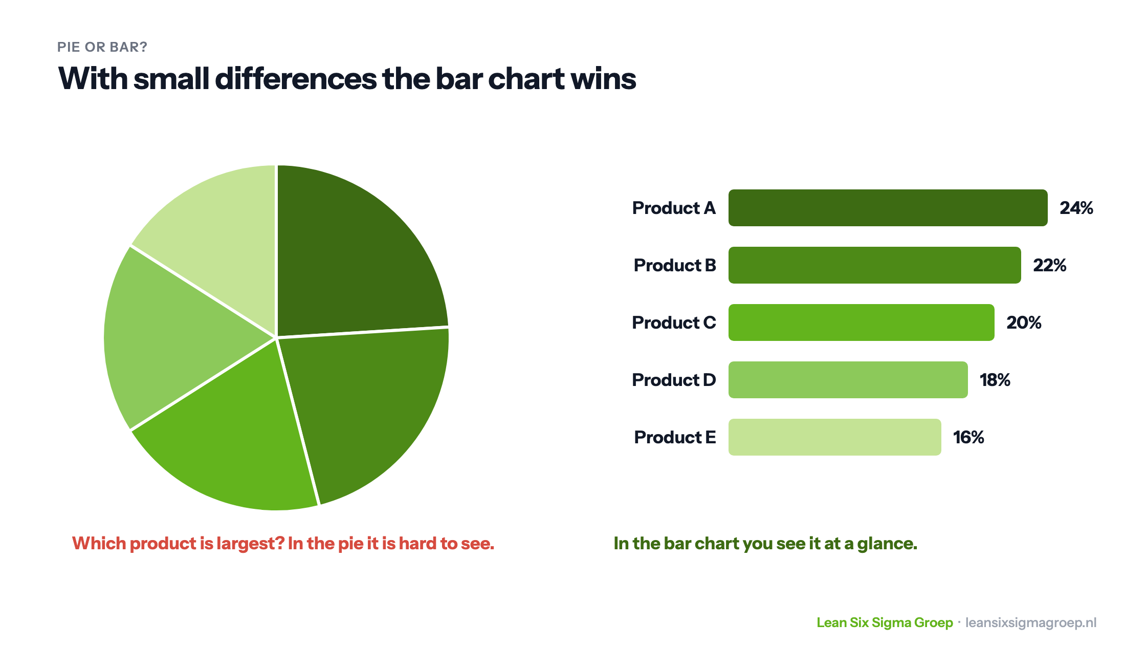
- Small differences are hard to see. People are poor at comparing angles and areas. If the shares are close together, the difference is barely visible in a pie, as shown below.
- Too many categories. With ten or more slices it becomes an unreadable pie.
- Reading exact values doesn’t work. You still have to add the percentages.
- 3D distorts. In a three-dimensional pie chart the front slices look bigger than they are. Never use it.
Pie chart or bar chart?
The image above shows the same data twice: the revenue of five products, from 24% to 16%. In the pie chart it is barely visible which product is largest. In the bar chart you see it immediately, because people compare lengths much better than angles.
The rule of thumb: if you want to show what part of the whole something is, and there are few categories with clear differences, a pie chart works. If you want to compare categories with each other, choose a bar chart. If you want to know which categories together cause most of the problems, use a Pareto chart. And for continuous data, such as lead times, a histogram is the right choice.
Well-known examples
You often see pie charts at elections, for the distribution of votes or seats, and in annual reports, for the breakdown of revenue or costs. They can also be handy for your own finances, for example to see where your monthly budget goes. But remember that a pie chart mainly gives an impression. For real analysis you need the underlying figures.
Conclusion
A pie chart is a simple and powerful way to show how a whole is divided, provided there are few categories and the differences are clear. With many categories or small differences, our Green Belt and Black Belt courses recommend a bar chart. There you also learn which chart fits which question and type of data.