A bar chart places categories side by side as bars, so you can see at a glance where the differences are. It is one of the simplest charts there is, and precisely for that reason one of the most useful in an improvement project: before you start on heavy statistics, a bar chart often already shows where to look.
What is a bar chart?
A bar chart shows a value per category: the number of complaints per department, revenue per region, the number of errors per type. Each category gets its own bar, and the length of the bar is the value. The bars stand apart, with gaps between them, because the categories are separate.
A bar chart therefore works with categories or with discrete (countable) data. You often collect it by tallying or counting. Bars can be vertical or horizontal; horizontal is handy when category names are long.
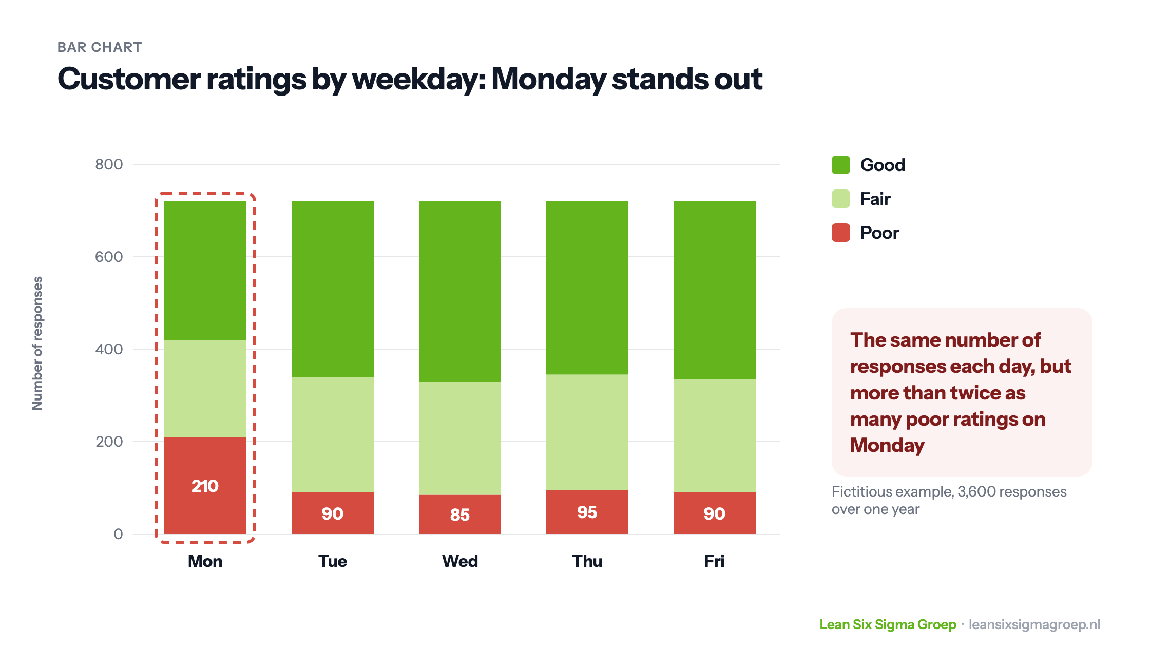
Variants are the grouped bar chart, with several bars side by side per category, and the stacked bar chart, in which each bar is divided into parts. The example at the top of this article is a stacked bar chart.
Where does it come from?
The Scottish engineer and economist William Playfair (1759-1824) was one of the first to use bar charts, in his Commercial and Political Atlas of 1786. It contained a bar chart of Scotland’s trade with other countries. Playfair also invented the line graph, and later the pie chart. The idea that a picture says more than a table full of numbers is more than two centuries old.
Bar chart or histogram?
A bar chart and a histogram look alike, but they are for different kinds of data, as shown below. The difference relates to the distinction between continuous and discrete data.
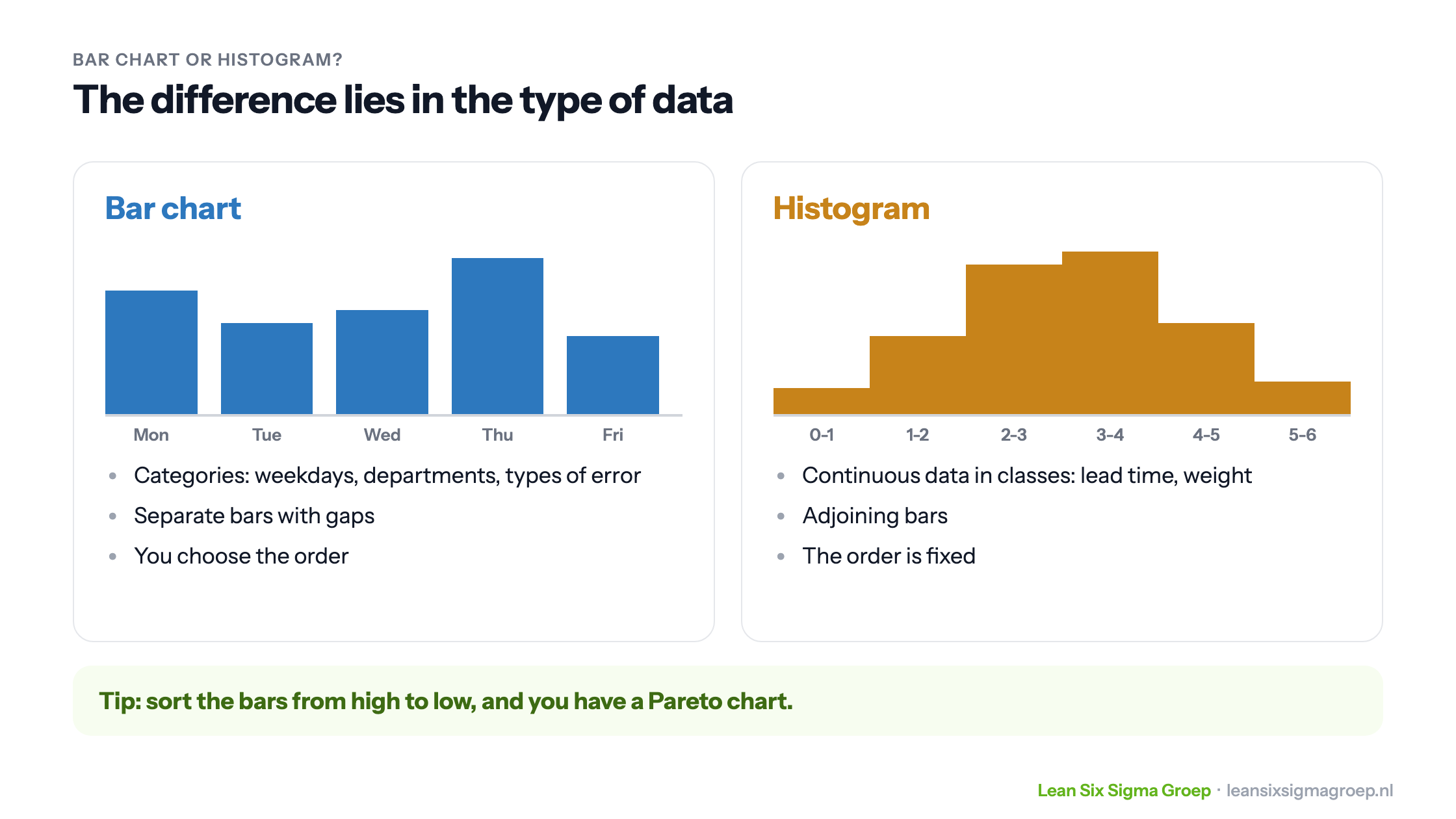
- Bar chart: for categories, such as weekdays, departments or types of error. The bars stand apart, and you choose the order.
- Histogram: for continuous data grouped into classes, such as lead time in days or weight in grams. The bars adjoin, because the classes adjoin, and the order is fixed.
Sort the bars of a bar chart from high to low, add a line with the cumulative percentage, and you have a Pareto chart. Read more in Pareto analysis.
The bar chart in an improvement project: an example
In Lean Six Sigma projects the bar chart is especially useful in the Analyse phase of DMAIC, when you look for the root cause of a problem.
A fictitious company asks customers after each contact whether they rated the service good, fair or poor. Month after month, more customers give a poor rating. Black Belt Ben gets to work. He makes a fishbone diagram and studies the process, but before starting on statistics he puts the data in a bar chart: the ratings per weekday, over a whole year, 3,600 responses in total.
Two things stand out immediately, as shown in the image at the top of this article. The number of responses is about the same every weekday. But on Monday more than twice as many poor ratings come in as on other days.
Is that difference real, or chance? You test that with a chi-square test, the usual test for counts per category. With these numbers the difference is clearly not chance. But a bar chart doesn’t yet say why. Ben knows fewer people work on Mondays, but he doesn’t want to make assumptions and goes to look on the shop floor. There it is confirmed: because of lower staffing on Mondays, customers wait longer, and that produces poor ratings.
The bar chart didn’t solve the problem, but it did point the way to the cause.
Tips for a good bar chart
- Start the axis at zero. The length of the bar is the value; an axis starting at 80 makes small differences look big.
- Choose a logical order. A natural order (weekdays, months) or from high to low.
- Use colour sparingly. One colour, and a striking colour only for what you want to show.
- No 3D. A three-dimensional bar is harder to read and adds nothing.
In the Green Belt and Black Belt courses you learn to make and use bar charts and other graphs to find causes.