Data analysis is collecting, organising and interpreting data to answer a question: how big is the problem, and what causes it? In Lean Six Sigma it is the way to get from a suspicion to proof, and to avoid tackling the wrong cause.
A classic example: John Snow and cholera
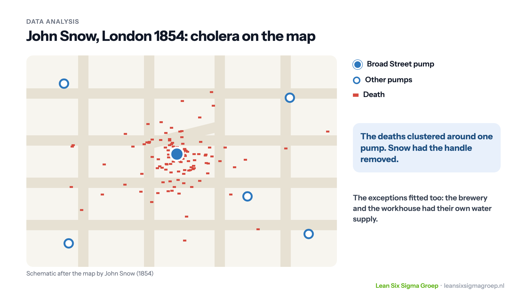
In the summer of 1854 a cholera epidemic broke out in the London district of Soho. Within ten days hundreds of people died. The common explanation was “miasma”: disease was thought to spread through foul air. The physician John Snow doubted this, and did something unusual at the time: he plotted all the deaths on a map of the district.
The pattern was unmistakable, as shown in the image at the top of this article. The deaths clustered around one water pump, in Broad Street. Snow also looked at the exceptions. In the brewery close to the pump hardly anyone fell ill: the workers drank beer, and the brewery had its own water supply. The nearby workhouse, with its own well, was also largely spared. And a few victims who lived further away turned out to fetch their water from Broad Street.
Snow persuaded the authorities to remove the handle of the pump. The epidemic was already past its peak, but his analysis became a milestone: it later turned out that the well had been contaminated by a cesspit right next to it. Snow is regarded as one of the founders of epidemiology.
What the example shows: it wasn’t meetings full of opinions that found the cause, but the data, cleverly visualised. And it pays to look at the exceptions: where does it go well, and what is different there?
Data analysis in Lean Six Sigma
In a Lean Six Sigma project, data analysis follows the steps of DMAIC. The aim can be summed up in one formula: Y = f(X). The Y is the problem, the outcome you want to improve. The Xs are the possible causes. The question is which Xs really determine the Y.
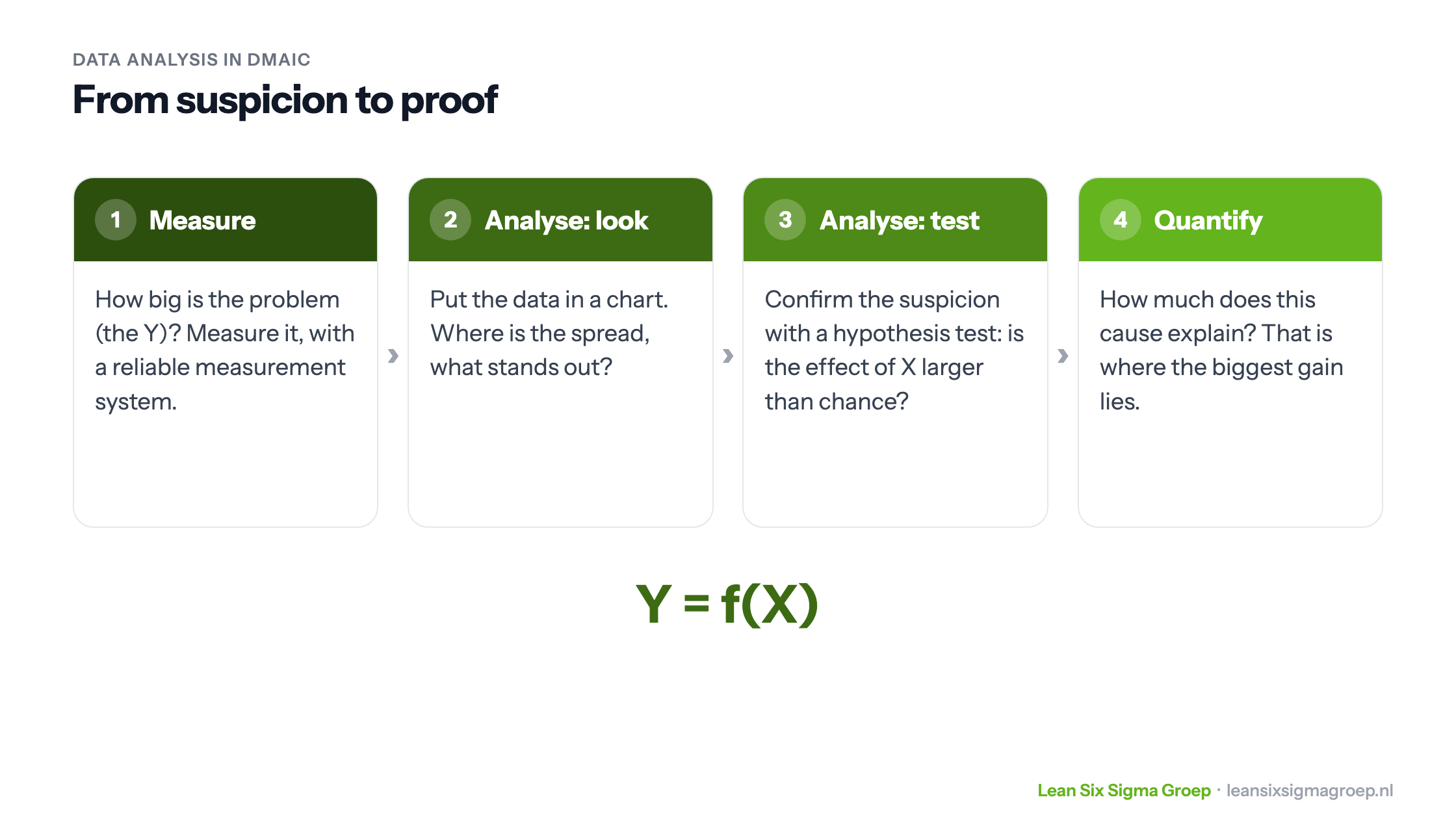
- Measure: how big is the problem? You measure how the process performs now, with a baseline measurement. First you check that your measurement system is reliable; otherwise you are analysing noise.
- Analyse: look first. Put the data in a chart, such as a histogram, a box plot or a scatter plot. Where is the spread, what stands out, where does it go well?
- Analyse: test. If you have a suspicion, confirm it with a hypothesis test. You start from the null hypothesis that there is no difference or relationship, and calculate how likely your data are if that is true. If that probability (the p-value) is very small, you reject the null hypothesis. Note: the p-value is not the probability that the null hypothesis is true.
- Quantify. How much of the spread in Y does this X explain? That tells you which cause offers the biggest gain.
It helps to know what kind of data you are working with; read more about continuous and discrete data. And a relationship is not yet a cause: read about that under correlation.
What does data analysis add?
An employee who has done the same job for twenty years can often judge well how a process performs. And there are other ways to find causes, such as a fishbone diagram or a value stream map. Data analysis adds two things. It establishes objectively how the process performs, even when experience says otherwise. And it shows how important a cause is, with a number instead of a feeling.
Data analysis mainly tests a suspicion. Searching large amounts of data for patterns you didn’t yet know about is called data mining.
In the Green Belt and Black Belt courses you learn not only to understand data analysis but to do it yourself, using Minitab among other tools.