Correlation is a statistical measure of the relationship between two variables: when one changes, does the other change too? In Lean Six Sigma, correlation helps you track down possible causes of a problem. But a relationship is not yet proof that one thing causes the other.
What is correlation?
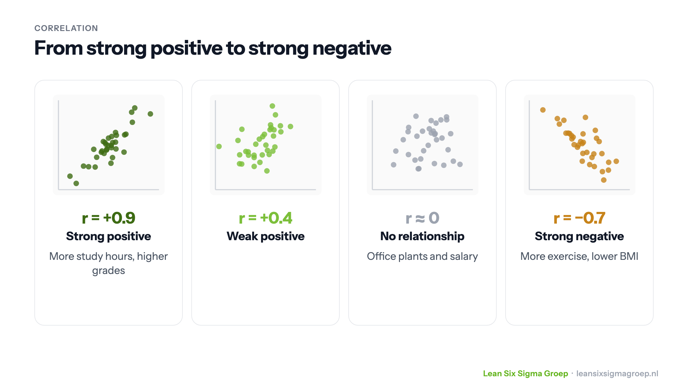
Correlation shows the extent to which two variables are related. There are three directions, shown in the image at the top of this article:
- Positive correlation: when one variable rises, the other usually rises too. For example: the more hours someone studies, the higher their grades usually are.
- Negative correlation: when one rises, the other usually falls. For example: the more someone exercises, the lower their BMI usually is.
- No correlation: there is no predictable relationship. For example between the number of plants in the office and employees’ salaries.
Measuring correlation
The most widely used measure is Pearson’s correlation coefficient, written r. It lies between −1 and +1:
- r = +1: a perfect positive relationship;
- r = −1: a perfect negative relationship;
- r = 0: no linear relationship.
The closer r is to +1 or −1, the stronger the relationship. As a rule of thumb, a value above 0.7 (or below −0.7) counts as strong, and a value between −0.3 and 0.3 as weak. Suppose you measure how many hours 50 people exercise per week and their BMI, and find r = −0.68. That is a fairly strong negative relationship: people who exercise more have a lower BMI on average.
Two points of attention:
- Look at the chart first. Always make a scatter plot. Pearson only measures straight-line relationships; a curved relationship can give an r close to 0 while there is a real relationship. One outlier can also have a big effect on r.
- Is the relationship real? With a small sample, a sizeable r may be due to chance. So also look at the p-value, which shows how likely such a relationship is to arise by chance.
Correlation in a Lean Six Sigma project
A manufacturer suffers from varying product quality and starts an improvement project. In the Measure phase, the team collects data on process variables such as temperature, pressure and speed. A correlation analysis shows a strong negative relationship between temperature fluctuations and quality: the more the temperature fluctuates, the lower the quality.
In the Analyse phase, the team checks whether that relationship is really causal, for example with an experiment in which the temperature is deliberately kept constant. In the Improve phase a better temperature control is installed, and in the Control phase the team keeps monitoring temperature and quality, so the improvement lasts. That is how correlation fits into the DMAIC cycle.
Correlation is not causation
The best-known pitfall is thinking that correlation automatically means cause and effect. Correlation only shows that two variables are related, not why.
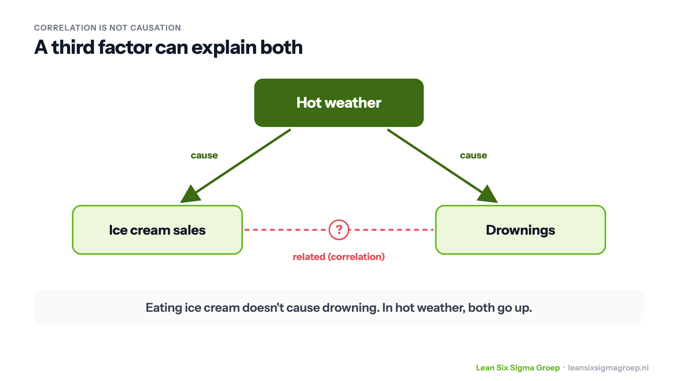
A classic example: ice cream sales and the number of drownings are strongly related. Yet eating ice cream doesn’t cause drowning. A third factor explains both: hot weather. Then people eat more ice cream, and go swimming more often.
So a relationship between two variables can have different explanations:
- A causes B;
- B causes A;
- a third factor causes both;
- it is chance.
To prove a cause you need more: a logical explanation, and preferably an experiment in which you change the suspected cause and see whether the effect follows. So use correlation to find where to look further, for example alongside an Ishikawa diagram, but not as the final conclusion.
Conclusion
Correlation is a powerful tool for finding relationships between process variables, and with them possible causes of problems. Use it together with a scatter plot, common sense and experiments, and don’t mistake a relationship for a cause. Correlation and regression analysis are covered in depth in the Black Belt training course.