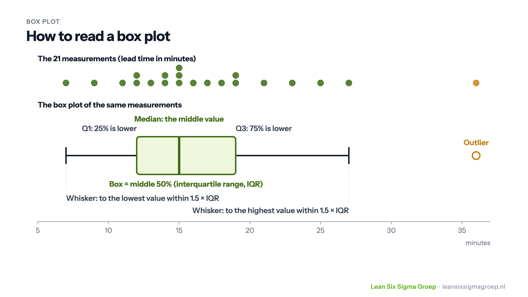
A box plot shows in a single figure how a set of measurements is distributed: where the middle is, how large the spread is and whether there are outliers. Put several box plots side by side and you see at a glance where groups differ.
What is a box plot?
The box plot, also called a box-and-whisker plot, was devised by the American statistician John Tukey. He introduced it around 1970 and made it known with his 1977 book Exploratory Data Analysis. A box plot works best with continuous data, such as lead times, weights or dimensions.
Suppose you measure the lead time of a process step. With a column of numbers in Excel you can calculate the mean and the median, but a table of figures per department or employee is hard to read. A box plot summarises the same measurements in a figure you can compare directly.
How to read a box plot
The image at the top of this article shows 21 measurements, with the box plot of exactly those measurements below. This is how a box plot is built:
- The measurements are sorted from low to high and divided into four equal parts, the quartiles.
- Q1, the first quartile, is the value below which 25% of the measurements lie. Q3 is the value below which 75% lie.
- The box runs from Q1 to Q3 and so contains the middle 50% of the measurements. The width of the box is called the interquartile range (IQR).
- The line in the box is the median: the middle value. So a box plot does not show the mean. Some programs, such as Minitab, can show the mean as an extra symbol.
- The whiskers run from the box to the lowest and highest measurement that still lie within 1.5 times the IQR from the box.
- Outliers are measurements that fall outside that range. They are drawn as a separate dot or asterisk.
A box plot also says something about the shape of the distribution. If the median is not in the middle of the box, or one whisker is much longer than the other, the distribution is skewed.
Comparing groups
The strength of the box plot lies in comparison. Put the lead times of four departments side by side and you immediately see differences in location and spread.
This is one of the tools you learn to apply in the Green Belt training.
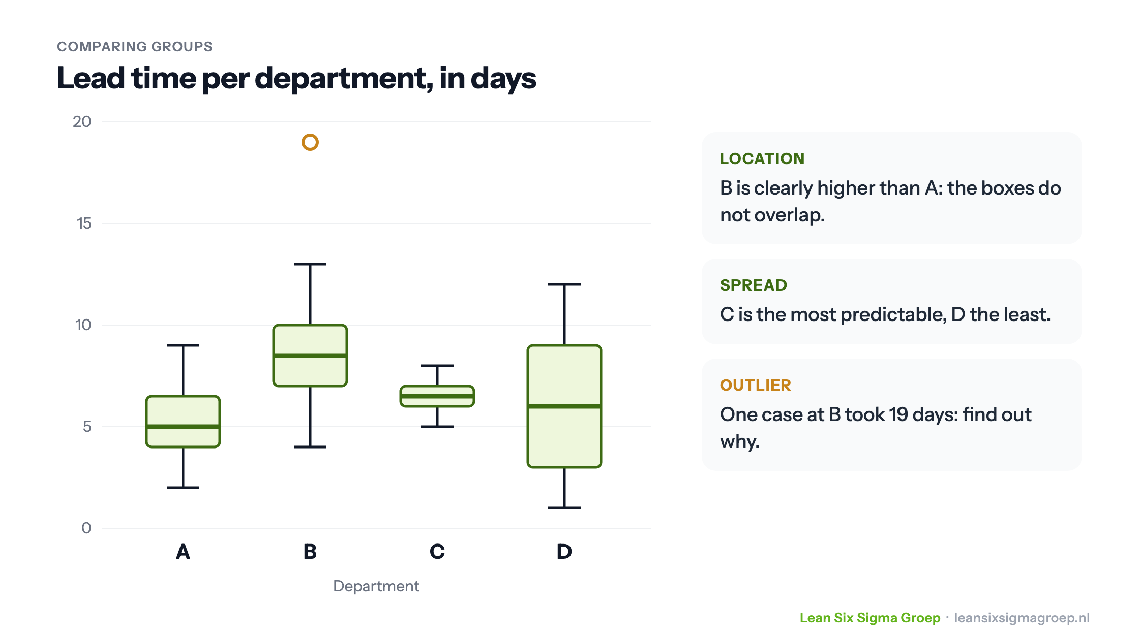
In this example you see three things:
- Location: department B clearly takes longer than department A. The boxes do not overlap.
- Spread: department C is the most predictable, department D the least. A customer of D doesn’t know what to expect, even though its median is close to A’s.
- Outlier: at department B, one case took 19 days. Finding out what happened there often yields more than looking at the average.
A box plot shows where to look, but proves nothing yet. Whether the difference between A and B is real or due to chance is something you test with a hypothesis test. The box plot also helps you choose the right test: if the spread differs strongly between groups, as between C and D, you choose a test that takes this into account.
Change over time
You can also place box plots side by side per period, for example per month. If the median drops month by month, the process is getting faster. If the boxes get shorter, the process is becoming more predictable. That way you can see after an improvement whether it really works.
Tips
- A box plot with very few measurements is not very reliable. With fewer than about ten measurements per group, use a dot plot instead, in which you see every measurement.
- A box plot hides the number of measurements. State it alongside, especially if the groups differ in size.
- To see the shape of the distribution as well, combine the box plot with a histogram, and read more about standard deviation as a measure of spread.
Want to learn how to use a box plot and how to back up differences statistically? You learn that in the Black Belt training course.