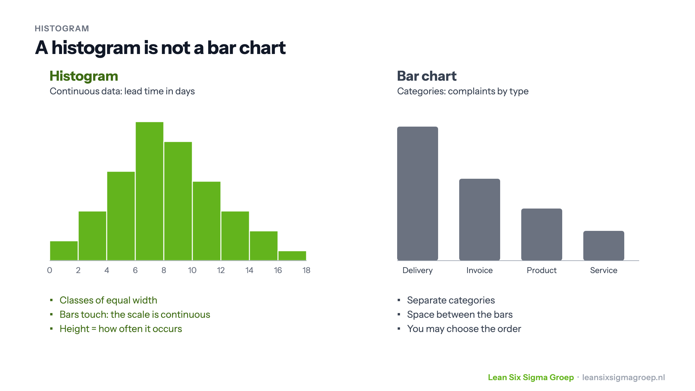
A histogram is a chart that shows how measurements are distributed. You divide the measurement scale into classes of equal width and count how many measurements fall into each class. That shows at a glance where most values lie, how large the spread is and what shape the distribution has.
What is a histogram?
You use a histogram for continuous data: measurements that can take any value in between, such as time, weight, temperature or distance. Take the lead time of an application. You divide the scale into classes, for example 0 to 2 days, 2 to 4 days, 4 to 6 days, and draw a bar per class as high as the number of applications in it.
A histogram looks like a bar chart, but is something different. The image at the top of this article shows how:
- A histogram shows a continuous scale. The bars touch, and the order is fixed: from low to high.
- A bar chart shows separate categories, such as types of complaints. There is space between the bars, and you may choose the order.
Making a histogram
- Collect enough measurements, preferably fifty or more. With few measurements the shape says little.
- Choose the number of classes. A rule of thumb is the square root of the number of measurements: about ten classes for 100 measurements. Too few classes hide the shape, too many make it messy.
- Make all classes equally wide and let them connect, without gaps.
- Count per class how many measurements fall into it, and draw the bars.
In Excel you make a histogram with the Histogram chart type; in statistical software such as Minitab it takes one click.
What does the shape tell you?
The strength of a histogram lies in its shape. It often tells you more than the average.
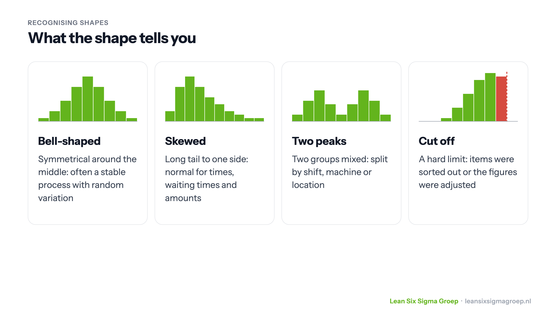
- Bell-shaped: symmetrical around the middle. Often a sign of a stable process with only random variation, and a hint that the data may be normally distributed. You only know for sure with a normality test.
- Skewed: a long tail to one side. Very common for lead times, waiting times and amounts. Then use the median rather than the mean.
- Two peaks: often two groups have been measured together, such as two shifts, machines or locations. Split the data and make a histogram per group. That often already reveals an important cause.
- Cut off: the distribution stops abruptly at a limit, sometimes with a conspicuously high bar just before it. That suggests items were sorted out, or values were “measured” just within the standard.
Also draw the customer’s specification limits in the histogram. Then you immediately see what share of the measurements falls outside, and whether the problem is the location (the middle is off) or the spread (too wide). That is also the basis for process capability, such as Cpk.
The histogram in Lean Six Sigma
In a Lean Six Sigma project you mainly use the histogram in the Measure and Analyse phases. In Measure it shows how the process performs now. In Analyse it helps, alongside a fishbone diagram and studying the process map, to find clues to causes: compare histograms per shift, per product or per period and see where they differ.
So the histogram is to the improver what Dr Watson was to Sherlock Holmes: it doesn’t solve the case, but it does point where to look. Whether a difference is real, you then test with a hypothesis test.
Both the Green Belt and the Black Belt training course teach you to work with histograms.