
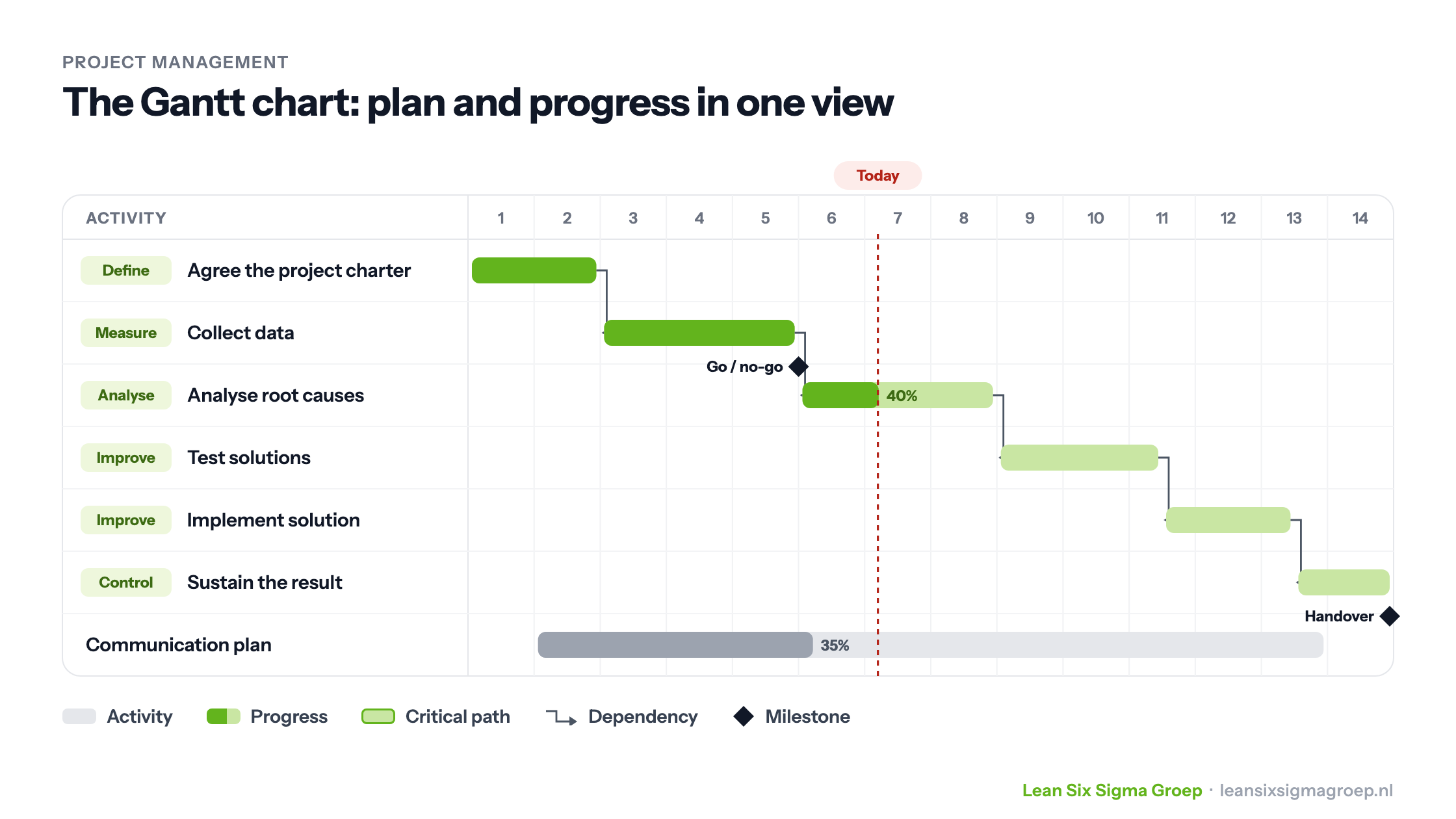
A Gantt chart is a chart, or diagram, for planning activities; it is widely used as a key tool in project management.
What does Gantt chart mean and where does it come from?
The first Gantt-style chart was devised in the mid 1890s by Karol Adamiecki, a Polish engineer who ran a steelworks in southern Poland and had developed an interest in management ideas and techniques.
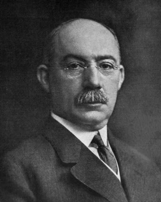
Around 1910, the American mechanical engineer Henry Gantt developed his own version of the chart as a visual aid for showing the planning and progress of complex projects. It was used, among other things, on the challenging construction of the Hoover Dam in 1931.
After the Second World War the tool became better known as a project planner and was taken up in business too. In those days Gantt charts were drawn by hand; every time a project changed, the chart had to be adjusted or redrawn, which limited their usefulness, since constant change was a feature of most projects.
Today this is far easier with computers and software, and the Gantt chart remains an indispensable planning tool.
What does a Gantt chart look like?
A Gantt chart consists of a number of rows, each representing a phase or activity within the project. The first phases or activities are usually at the top, and time runs along the x axis. For each activity, a bar shows when it should start and when it should finish.
You can also show dependencies, making it clear, for example, that activity B cannot start until activity A is complete; this is shown with arrows between the tasks. Milestones (black diamonds) mark an important moment, such as a delivery date or a key decision that has to be made.
The more complex a project, the more complex this project management tool looks. Especially as the dependencies between the various activities increase, it becomes harder to map them out.
Gantt chart example
This is one of the tools you learn to apply in the Green Belt training.
Download a handy template for the Gantt chart in Excel here.
Modern use
This handy planning tool has moved with the times and is rarely written out by hand on large sheets of paper any more. Today there is a wide range of software based on its classic look.
From simple Excel files to Microsoft Project and more advanced project management software that can calculate to the minute when a project will finish, the programs largely work in the same, relatively simple way.
It is an effective tool for roles such as:
- Project managers
- General managers
- Team leaders
- Operations managers
- Works managers
- Marketing managers
Today, with the wide range of project management and Gantt chart software available, anyone can use Gantt charts online.
How do you make a Gantt chart in Excel?
Want to make a Gantt chart yourself, but have no dedicated software to hand? Then you really have two options: Jira or Excel. For many people Excel will be the first choice, if only because it is so familiar and widely available.
Making a Gantt chart involves two phases: creating the plan and following the plan. Your Gantt chart needs to support both.
Phase 1: Creating the plan
You usually start by naming the big chunks of work your project consists of. Each chunk is then broken down into the activities needed to deliver it. This calls for some knowledge of how the product is made.
Otherwise there is a good chance that things are forgotten or that the time they take is misjudged, which creates a lot of rework later in the project to put things right.
So for each activity you need to estimate the effort involved. This is translated into the amount of time it takes to complete that activity. Not every activity can be done in one go.
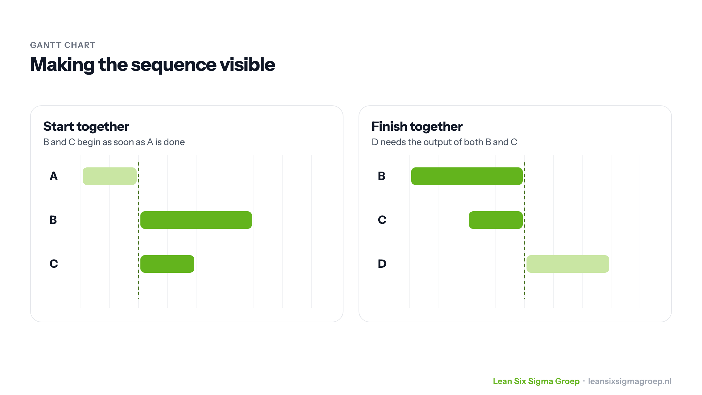
Sometimes activities are spread over a longer period, so give each activity a start and end date as well. Think carefully about the order of the activities, so that the picture the chart presents shows a clear sequence.
Keep two things in mind here:
- Activities that can start at the same time, because the preceding steps provide their input. You show this by having their bars, which represent time, start at the same moment:
- Activities that must finish at the same time, because their combined output is needed for the next activity. Make this visible by giving them the same end date:
Download a handy template for the Gantt chart in Excel here. In the template example you can see the phases, the big chunks, being filled in with activities. Ideally, the software shows the time input, start date and end date graphically. That is the whole idea of the Gantt chart.
Phase 2: Following the plan
Because the chart shows graphically which activities are carried out when, it is particularly useful for tracking the project.
You monitor progress by showing in one of the columns what percentage of each activity has been completed, say 50%. Always look at this alongside how much time is left for that activity. In other words: is the activity 50% done halfway through the time planned for it?
That way you can quickly see whether it is ahead of or on schedule (all good) or behind compared with the time it has left (not good). In the latter case you need to step in and, above all, discuss what is needed to finish on time after all.
Critical path
This matters most when the activity lies on the so-called critical path of the Gantt chart. The critical path is the chain of consecutive activities that determines the total lead time of the project.
How do I use a Gantt chart in Jira?
Jira lets you build a project plan from user stories, epics or tasks, typical items familiar from Scrum. The tasks are worked out from the user stories, which is what we called the big chunks above. Next come the activities that turn them into finished user stories. The user stories can therefore be seen as the products.
In Jira, tasks are created as cards. You can drag these cards around to show clearly what the status of each task is. In Excel you could add this with an extra column.
In Jira you can assign team members to the tasks or cards to carry them out, as well as a schedule: when it must start or must be finished.
Jira uses the order of the cards and the dates entered on them to work out the order in which the activities are carried out and, just like the Excel example, can plot this over time.
Go to ‘Tracking’ or ‘Reporting’ and you will see a Gantt chart, where following the project plan is clearly the starting point: are we on schedule?
Benefits of a Gantt chart
Besides giving a clear overview of a project’s progress, a Gantt chart also gives employees clarity. They can easily track the progress of the project and its various activities and subtasks for themselves, so they know exactly where the bottlenecks are. That is why this handy project management tool is also used as a management tool.
With an electronic Gantt chart, changes can be processed quickly and others can view the schedule too.